So with the visual elements of the reel finished I’ve spent the early part of this week finalising the music. I’ve got a candidate mix for final integration but I need to live with it for a few days to see if any niggling issues emerge. In the meantime I’ve turned, somewhat reluctantly, to development of a visual identity for this site, presentations and the like. I have to say it’s the task I’m least comfortable with. It’s not that I don’t know colour palette theory or how to set up a grid system or the qualities of a Grotesque typeface contrasted against a Humanist one; it’s rather that I really struggle to settle on a selection that will represent me. I’ve been doing some background reading and doing some trials here and there but to date nothing has really gelled. It’s one of those tasks that I’d really appreciate having the support of a graphic designer!
However, I hit upon something this afternoon that I’m feeling quite good about. I’d already done some font selection for the reel titles and had settled on Googles webfont ‘Lato’. The font is described as…
“Male and female, serious but friendly”
…and I felt that was a good match for the duality of Creative Technology. I also liked the way my name looked set in the typeface so it was a good starting point.
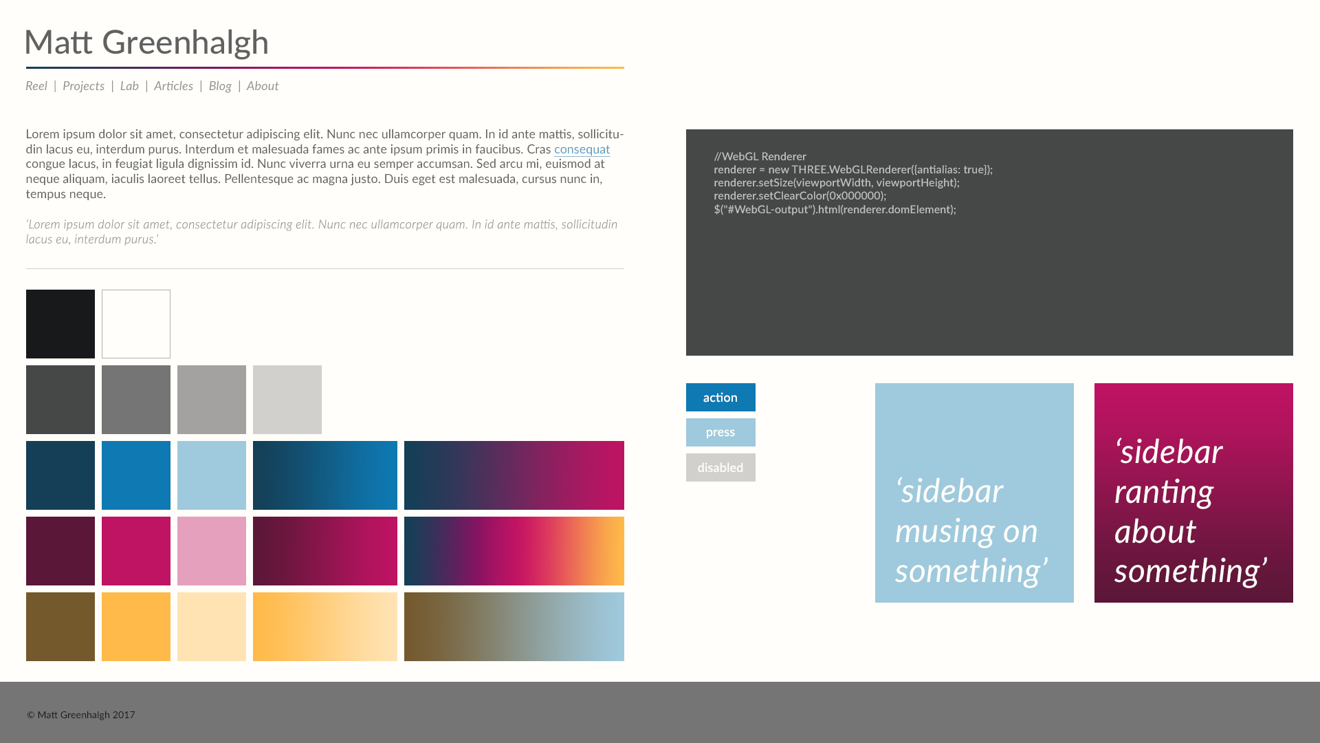
As regards the colour palette, I wanted to have a fairly neutral canvas for the site that would allow work to speak for itself. So I started with a cool off-black and a warm off-white. I developed some intermediate shades and then turned to Adobe Color CC and Coolors for help finding some accent colours. I knew I wanted some vivid, contemporary colours that would provide strong blocks and gradients. A strong blue was going to be good for hyperlinks and action buttons and was based on the same hue as the off-black base. The contrasting Magenta had a real punch and could create some strong gradients. Finally the orange-yellow offered up some rich palette combinations and a contemporary counterpoint to the other accent colours. I developed dark and light tints of each of them and worked through some of the common UI elements to see how they held up.
I’m pretty pleased with the results. There’s enough neutrality in the background and text elements to let content stand out but some visual interest in the accents to give blog posts and presentations some visual punch. Next step is to generate CSS for these elements and update the site to see how it all looks. Can’t promise I won’t change my mind but it will be an improvement on the current look 😉